Did you know that colors can influence your mood and feelings?
For example, blue can enhance your productivity, red makes you become more passionate while white and light purple give you a sensation of calmness and serenity.
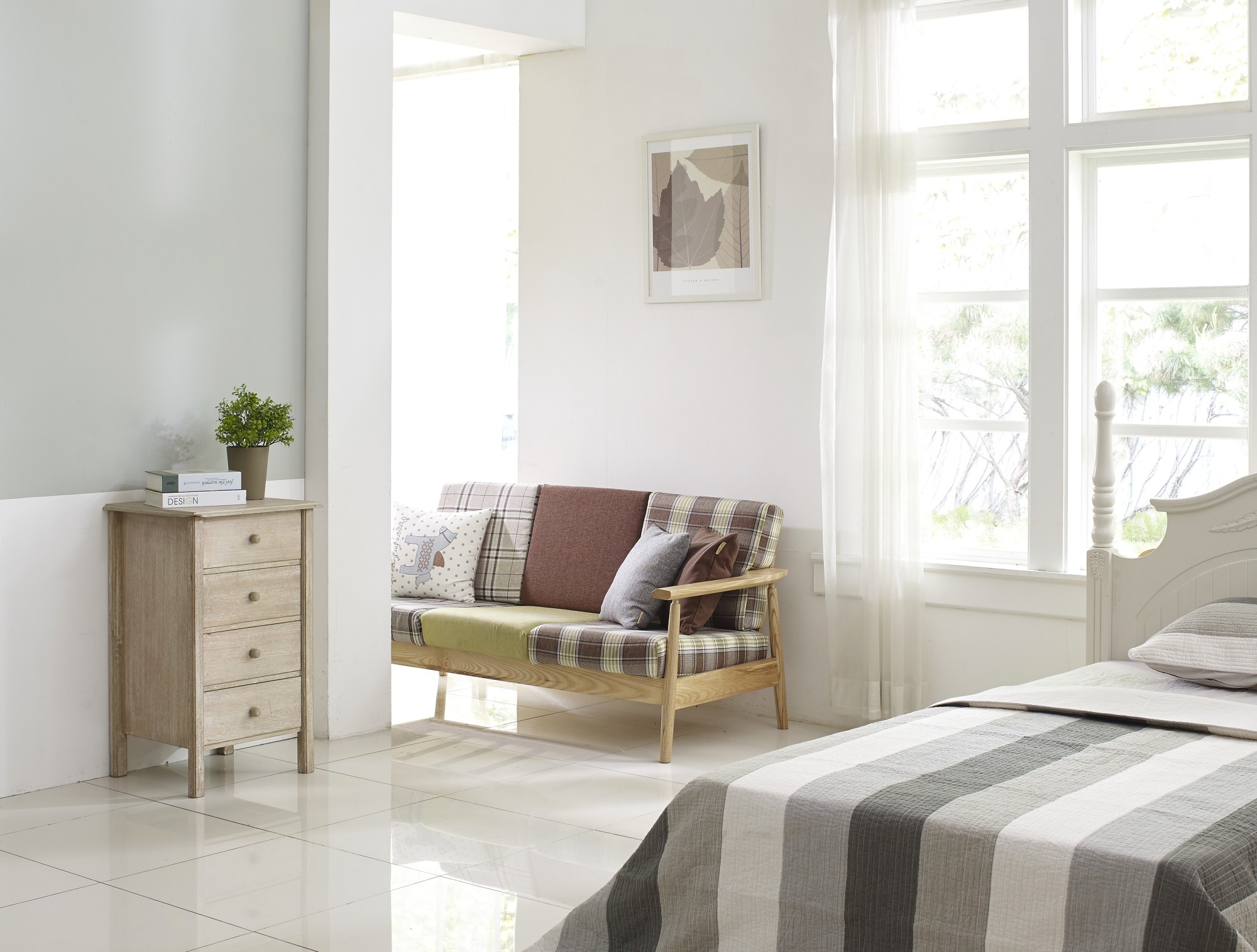
Obviously, you should take these facts into account when thinking about room color ideas for your new property. The way you paint the interior of your house can have a powerful effect on your mind and quality of life.
At the same time, certain color mistakes can make your rooms look less aesthetically pleasing. Some colors also don’t match with the furniture or floors and you need to avoid this mistake.
Top Mistakes to Avoid When It Comes to Room Color Ideas
When considering the paint job of your property, it’s a great idea to work with a painting company, so that you can save time and effort. However, you can also consider painting your rooms a DIY project.
If you’re brand new to painting your rooms, keep reading this article to get a better understanding of room colors.
1. You Don’t Test The Paint Before
You’ve decided upon a color, you bought it from the store, you come home and you immediately start painting the walls. This is a bad idea.
The first thing you should do is to paint a small and inconspicuous part of a wall and see how the paint looks. If you’re happy, you can move on to paint the rest of the room. If you’re not happy, try to replace the paint you bought or combine it with other paints to achieve the desired nuance.
2. Painting the Ceiling White
Most homeowners decide to paint the ceilings of their rooms white, but this can be a mistake. First of all, all white paints contain a small amount of gray in it, so the ceiling will eventually look grayish, not completely white.
Secondly, the ceiling receives less light in comparison with the walls and floors of your rooms, so its color will always look slightly darker. It’s simply better to pick a different color than white to have a room which stands out from the crowd.
3. Combing Up with Weird Color Combinations
Some colors go well with other colors, this is a known truth. The human eye simply “appreciates” certain color schemes better than others. These are called complementary colors.
For example, blue goes well with orange. Red goes well with green. Yellow goes well with purple. You can find out more combinations that pan out by simply Googling a color wheel online.
Combinations which don’t work very well include red with purple, blue with green and yellow with orange. When painting the walls of your rooms, keep that in mind. Also, remember that the furniture items also add to the overall color scheme, so you should take them into account as well.
4. Using Too Many Colors
It’s great to experiment with various color combinations and shades. However, mixing together more than 3 colors can be a problem, especially if these colors don’t seem to be complementary.
For example, having brown hardwood floors, yellow walls and orange curtains doesn’t really work. Yes, you also have to consider the colors of the curtains when painting. Having walls painted in different colors can also be a recipe for disaster because these colors send you mixed feelings.
It’s best to stick with a color for 80% of the wall and use accent colors which go well with it. A bicolor design might appear to be outdated, but it works in most cases.
5. Painting First and Then Adding The Furniture and Curtains
This is another common mistake homeowners make. It’s not a good idea to paint the room first and then find furniture items and curtains which match its color. The correct way is to pick your furnishings and then go for a color scheme which matches it. This process is simpler and it can save you a lot of money.
At the same time, if the first layer of paint you applied seems to be “off” with the furnishings, you can simply apply a different nuance later on. If you paint first, it will be harder for you to find furniture items which match the colors of your walls.
6. Going All-White
White is a nice color which makes everything look clean, tidy and peaceful. However, it can also get boring at some point. Certain homeowners make the mistake of going all-white in their rooms by having white floors, white walls, and white ceilings.
Even the furniture items might have a light color to make everything look nearly monochromatic. It’s very likely that you’ll become bored with this design, not to mention that it gives the sensation of being in a hospital. Other monochromatic designs are also to be avoided such as all-brown (usually encountered in old homes).
7. Not Balancing the Color Scheme
It is true that once you like a color, chances are that you’ll want to use it too much.
However, this can be a mistake because using a color excessively can reduce its potential and make the room look one-dimensional. It’s a good idea to use balancing colors which emphasize the original one, but don’t let it become too dominant.
For example, you can balance a strong color such as red with a dash of green or simply white. This will reduce the intensity of the red, but still preserve it as a primary color.
Start Painting Your Rooms Today!
Now you know the basics when it comes to room color ideas and you can make better decisions when painting. If you think it’s too much of a hassle, you always have the opportunity to work with a private contractor and get the job done quicker and easier.
If you have questions or comments, don’t hesitate to contact us today and share your opinions and experiences!